
The NEW Subtle Art of Designing Your Substack So It Looks Established
New features and secrets only the top 1% know that make your newsletter look established

Substack quietly shipped a whole new homepage design that helps you carefully design your space on the platform so you make internet money.
Here’s everything you need to know to make subtle visual choiced to build a Substack that’s designed to make money from day one - based on the latest changes.
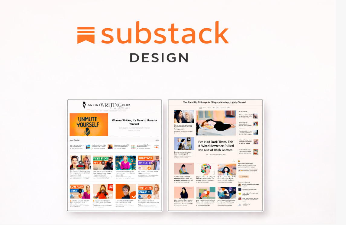
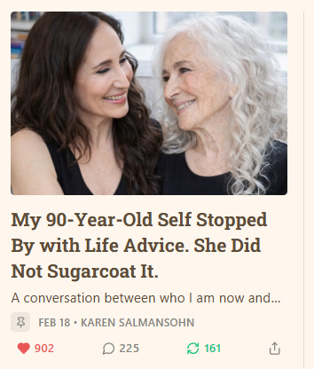
Karen Salmansohn (featured in the cover) is a beautiful example and rising bestseller in #Education.

Her established-looking Substack is home to posts like these with 900+ ❤️❤️❤️❤️❤️❤️
Spoiler: Author, designer and mortality movement activist Karen from New York and I plan to offer a LIVE Substack Design masterclass soon.
You might wonder:
How is Karen doing this? Why does her publication look soooo good and established? How did she add the yellow colour, the logo with the smiley, the buzzy navigation bar and links on the right hand side?
I’ve got you covered, my online writing friend.
So now let’s talk about the subtle art of designing your Substack newsletter in 2026.